Metallic Ink That Earns Its Place: A Practical View for UK Litho Buyers

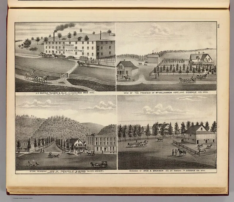
Photo: Basile Morin, CC BY 4.0, via Wikimedia Commons
Metallic ink is often treated as a shortcut to a premium feel. It is not. It is a material with its own behaviour, its own drying characteristics and its own limits. Used well, it can make a brochure, annual report or packaging piece feel considered. Used vaguely, it can look patchy, scuff on the shelf and cost more than the designer expected. The difference is rarely a matter of taste. It is a matter of specification.
A material, not a mood
Metallic litho inks are usually spot inks, not process colours. Silver inks are typically based on aluminium pigment; gold inks on bronze or similar pigments. The particles are larger than those in conventional inks and tend to sit nearer the surface of the stock. That is what produces the reflectiveness, but it also explains why metallic ink behaves differently from CMYK. It does not simply “print like a colour”. It interacts with the paper, the press settings and the finishing process.
For UK buyers, the two most familiar references are Pantone 877 for silver and Pantone 871 for gold, though printers may mix to a house standard or a brand-specific match. A metallic ink can be printed as a solid, as a tint, or as fine detail. Each choice changes the risk profile. Large solids are more likely to show mottling or drying problems; fine lines and small accents are usually more forgiving.
The stock decides whether metallic looks expensive or merely shiny
On a coated silk or matt stock, metallic ink sits on the surface and can reflect light cleanly. That is often the brightest result, but coated stocks can also slow drying because the surface is less absorbent. On uncoated stock, the ink is drawn into the paper to some degree, which dulls the shine but can produce a more integrated, less flashy effect. Neither result is inherently better. The question is whether the design needs a mirror-like glint or a warmer, more tactile sheen.
A gloss coated stock can give the highest initial reflectivity, but it can also make a metallic accent look cheaper if the whole piece is glossy. A textured uncoated board may look more sophisticated with a restrained metallic, but the same ink may appear uneven across a large solid. For anything important, ask for a drawdown or a printed sample on the intended stock. A metallic ink shown on a different paper is only a rough guide.
Coverage and drying: where metallic jobs go wrong
Metallic inks can be slower to dry than conventional inks, particularly when they are laid down heavily on coated stock. If the sheets are stacked too soon, set-off can occur — ink transferring from one sheet to the back of the next. Scuffing is another common complaint, especially on covers or areas that will be handled. A printer may need to adjust spray powder, use IR drying, or allow more time before finishing.
Coverage is the buyer’s lever. A large solid metallic panel looks dramatic in a design visual, but it is one of the harder things to print consistently. Fine detail, rules, small logos and restrained panels are more predictable. If the design calls for a large metallic area, ask the printer whether an overprint varnish or a matt lamination is advisable. Lamination can protect the ink, but it can also change the sheen; a gloss laminate may intensify the metallic effect, while a matt laminate may soften it.
Trapping and overprinting also need thought. Metallic ink printed beneath or beside process colours can create unexpected edges if the trapping is not handled well. It is usually better to keep metallic areas separate from heavy process builds and to let the printer advise on the order of working.
Where metallic ink beats foil and digital
Foil blocking produces a sharper, more mirror-like finish than metallic ink. It is excellent for a small logo or a fine crest, where a true metallic stamp is the point. But foil requires a die, which adds setup cost and usually makes it less economical for large areas or shorter runs. Metallic ink can cover a wider panel more cheaply at litho volumes, though it will not match foil for sheer reflectivity.
Digital metallic effects have improved, and they can be useful for very short runs or variable work. But they are not a like-for-like replacement for litho metallic ink on long-run brochures and packaging. Digital toner metallic can be less durable and is often limited by the stock it will adhere to. For a UK print buyer weighing 500 copies against 5,000, the decision is usually less about which effect looks best in a sample and more about which process suits the run length, the stock and the finishing plan.
How to specify metallic litho in the UK
A clear brief prevents most surprises. Include the following:
- The exact stock, including brand, weight and finish. “Good quality coated” is not a specification.
- The metallic reference, such as Pantone 877 or 871, or a supplied drawdown.
- The coverage: solid, tint, fine detail, or a combination. Mark up the artwork so the printer can see where the metallic sits.
- Whether the metallic will be varnished, laminated or left uncoated. This affects both appearance and durability.
- The finishing route: folding, creasing, die-cutting or binding. Metallic ink on a fold line can crack if the stock and ink are not matched.
- A request for a wet or pressed proof on the intended stock for anything above a routine job.
It is also worth asking about batch consistency. Metallic pigments can vary slightly between batches, and a printer who understands this will usually print enough overs to allow for spoilage. If the piece is part of a campaign with reprints, ask whether the ink can be held or matched later.
The budget case
Metallic ink adds cost: an extra plate, a spot ink, potentially slower running and extra drying time. It is rarely the cheapest way to add visual interest. But it can be cheaper than foil blocking across a large area, and it can give a more integrated result than a digital effect on a long litho run. The sensible use is as an accent — a title, a rule, a small panel, a logo — rather than as a default background.
A sober view is not a pessimistic one. Metallic litho earns its keep when the design, stock and finishing are planned together. It disappoints when it is added late as a decorative afterthought. For 2026 budgets, the question is not whether metallic looks luxurious. It is whether the job can carry the ink properly, on the right paper, with the right drying and finishing. If it can, the result will look considered. If it cannot, no amount of shine will hide it.