Before the Plates Go On: A Print Buyer’s Pre-Flight Checklist for Litho Files
Photo: Andreas, A. T. (Alfred Theodore), 1839-1900 Chas. Shober & Co., Public domain, via Wikimedia Commons
A litho run has a rhythm. Plates are made, ink is set, make-ready sheets are pulled and the press settles into the job. When that rhythm is interrupted, the cause is often not the press but the file. A missing bleed, an RGB image or a font that has substituted can turn a straightforward production slot into a series of proofs, emails and revised plates.
At Argent Litho, the same handful of file issues appear again and again. None of them are unusual, and none of them are difficult to fix. The difficulty is catching them before the file reaches pre-press. A ten-minute check at the buyer’s desk can save days of back-and-forth and keep the press schedule honest.
Why Pre-Flight Matters on a Litho Run
Litho is efficient because the cost of the run is spread across the sheets. The make-ready, plates and ink setting are part of that equation. A file problem discovered after proofing can mean new plates, a new make-ready and a revised delivery date. Even when the printer can absorb the change, the schedule rarely can.
Pre-flight is not about blaming the designer. It is about confirming that the file contains what the printer needs: the right page size, the right colour data, the right images and the right separation of elements. A clean PDF is not a guarantee of good design, but it is a guarantee that the press can reproduce the design as intended.
Bleed and Trim: The Three Millimetres That Save a Re-Run
UK litho work normally expects 3 mm of bleed on trimmed edges. That means backgrounds, images and solid colours must extend beyond the finished trim size. Crop marks should sit outside the bleed area. Text and critical elements should stay well inside the trim, not sitting on the edge where a small movement in cutting will show.
Check that the PDF page size matches trim plus bleed. An A4 job, for example, may be supplied as 216 by 303 mm rather than 210 by 297 mm. If the file has no bleed and the design has a dark edge, the guillotine has no room for normal variation. The result is a white sliver, a reprint or a compromise. Ask for the printer’s bleed requirement before exporting, especially on folded, die-cut or short-trim jobs.
Colour: RGB, Spot Colours and Rich Black
Litho presses print in CMYK, with spot colours added where needed. RGB images may look fine on a monitor, but they must be converted to CMYK using an agreed profile. In the UK, FOGRA39 for coated stock is a common reference, but the printer should confirm the profile for the job. Do not rely on an office laser printer to judge the final colour.
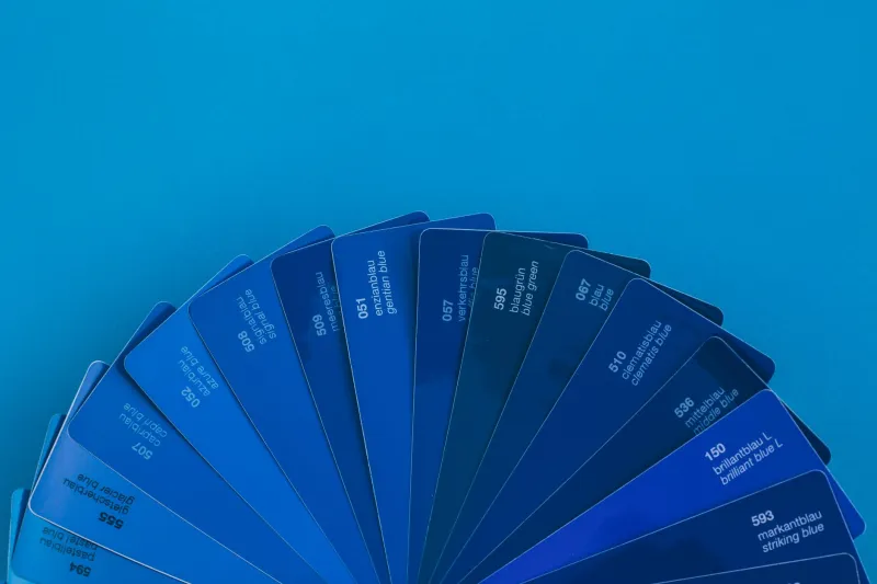
Brand colours deserve a contract proof or a previously approved reference. A logo built from a spot colour should be named consistently and kept separate from process builds. For large solid black areas, a rich black build can give depth, but small text should normally remain 100% black to avoid registration problems. Mixed blacks across a document are a common source of surprise.
Resolution and Logo Quality: 300 dpi at Final Size
Images should generally be 300 dpi at the size they will print. A photograph that looks sharp at 72 dpi on screen may be soft on a litho sheet. Line art and logos may need higher resolution or, better still, vector artwork. The most common offender is the logo pulled from a website, saved as a small PNG and enlarged on the cover.
Check the effective resolution after scaling. A 300 dpi image at 50 mm wide becomes 150 dpi at 100 mm wide. If the logo only exists as a screenshot, ask the client or brand owner for the vector or high-resolution original. It is faster to fix this before proofing than to explain a soft logo after the sheets are printed.
Fonts: Embed or Outline
Fonts should be embedded in the PDF. If native files are being supplied, include the font files or confirm that the printer has the licensed versions. Missing fonts can substitute silently, changing line breaks, spacing and the look of a headline. Fake bold and fake italic are also worth checking; they are rarely acceptable in print.
Outlining all text can solve a font issue, but it also removes searchability and can make small corrections harder. Use outlining selectively and only when agreed. If the job is likely to be amended, keep an editable version with the fonts available.
Overprint and Knockout Surprises
Overprint settings are where otherwise clean files can go wrong. White text set to overprint may disappear against a coloured background. Black text set to overprint can look deliberate on a proof and wrong on press. A spot varnish or UV layer may be set to overprint when it should knock out, or the reverse.
Open the PDF in Acrobat, turn on Overprint Preview and check the separations. Look at white type, small black type, logos and any finishing layer. If the file uses transparency, confirm how it will be flattened or handled in the PDF/X workflow. A two-minute overprint check is cheaper than a plate remake.
A Ten-Minute Pre-Flight Routine
Start with the page size. Confirm trim, bleed and crop marks. Then check the output preview: CMYK, spot colours, overprint and any unexpected separations. Run a pre-flight profile such as PDF/X-4 if the printer accepts it. Check image resolution at final size, then confirm fonts are embedded or supplied. Finally, list the spot colours and finishing layers so the printer knows what each separation is for.
If you are sending native files, package them with links and fonts, and say which file is the master. If you are sending a PDF, send the print-ready version and a low-resolution proof for reference. Label the file with the job name, version and date. Clear file naming is a small habit that prevents large mistakes.
What to Send and What to Say
A useful handover includes the print-ready PDF, the trim size, the bleed, the colour profile, the spot colour list, any die lines or finishing artwork, and a contact who can answer questions. If the job is a reprint, quote the previous job number so the printer can compare files. If a colour has been approved before, say so and supply the reference.
Pre-flight is not bureaucracy. It is the point where the buyer and the printer agree what the file contains before the plates are made. Ten minutes of checking keeps the press schedule predictable, avoids avoidable charges and leaves the production time for the thing that matters: printing the job well.