Finishing Budgets: What Makes a Litho Job Look Considered, Not Costly
Finishing is often presented as a menu of extras: laminate this, foil that, add a spot UV here. For UK marketers and print buyers, the more useful question is not whether a finish looks attractive in isolation, but whether it earns its place on the job. A well-chosen finish can make a brochure feel more considered, protect a cover through the postal system or give a mailer a reason to be kept. A poorly chosen one adds cost, make-ready time and production risk without changing how the piece is perceived.
At Argent Litho, we see finishing decisions work best when they follow the purpose of the printed item rather than lead it. The five touches below can all add value. The two that follow them often do not.
Start With the Job, Not the Finish
Before specifying anything, describe the life of the piece. Will it be posted, handed out at an event, filed on a shelf or used daily in a training pack? Will it be handled by a receptionist, a procurement team or a courier? A finish that protects a cover in transit is doing a different job from one that signals quality on a boardroom table.
This matters because finishing costs are not only material costs. Each additional process brings make-ready, spoilage, drying time and handling. A simple finish applied for a clear reason usually looks more expensive than a complicated combination applied because it was available.
Lamination: Protection First, Sheen Second
Lamination is the most straightforward finishing choice. Matt, gloss and soft-touch laminates each change how a cover feels and how it wears. Gloss gives contrast and wipe-clean protection. Matt reduces glare and gives a more restrained appearance. Soft-touch creates a distinctive tactile surface, though it can mark more readily in heavy handling and is not always the right choice for a piece that will be folded repeatedly.
Lamination earns its place on covers, menus, folders and mailers that need to survive handling. It rarely earns its place on internal text pages, where the reader is turning pages rather than judging a cover. Specify the laminate type and whether it is one side or two. If the piece will be folded after lamination, say so at quotation stage; not every laminate and fold combination behaves the same way.
Spot UV: Contrast or Cost?
Spot UV works when it creates contrast. A gloss varnish on a matt laminated cover, used to pick out a logo or a pattern, can lift a design without adding another material. It is less persuasive when applied as a flood varnish across the whole sheet with no real design reason. At that point it is often an expensive way to make an already glossy surface slightly glossier.
Spot UV needs its own artwork layer, usually a separate spot colour named clearly for the printer. Specify the areas, the side and the coverage. Fine detail and small type can disappear or fill in, so keep the varnish area simple enough to read. Ask for the spot UV to be quoted separately from any overall varnish so you can see what the contrast is actually costing.
Foil Blocking: Attention With a Budget
Foil blocking is a strong signal when used with discipline. A small foil logo on a cover, a foiled title on a presentation folder or a metallic detail on a invitation can create a focal point that print alone struggles to match. The cost is driven by the die, the make-ready and the area covered. Large solid foils are rarely cheap, and they can be less forgiving on textured or uncoated stocks.
Specify the foil reference, the area to be foiled, whether it is over print or blind, and the stock it will sit on. If the foil is registered to printed artwork, allow for the tolerances of the process. Foil is most effective when it is the exception rather than the rule; a single foiled element on an otherwise quiet cover often reads as more premium than several competing metallic areas.
Embossing and Debossing: Texture You Can Feel
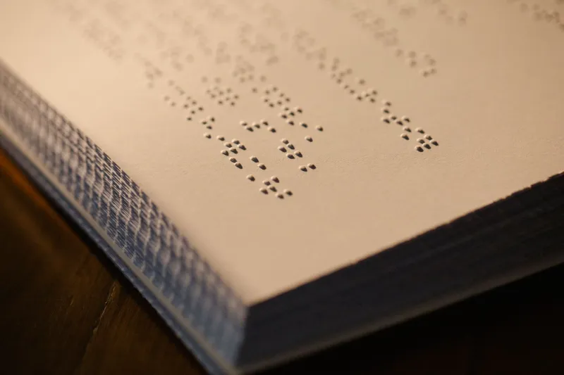
Embossing and debossing add a tactile quality that photographs poorly but performs well in the hand. A blind emboss on a cover, a debossed logo on a folder or a registered emboss through printed artwork can make a piece feel substantially more considered. The finish depends on a die, pressure and a stock with enough substance to hold the shape.
This is where paper choice matters. A lightweight text stock may show through, cockle or lose the crispness of the emboss. A heavier cover board gives the die something to work with. Specify the depth, the area and whether the emboss is blind or registered. If the piece will be mailed flat, check that the embossed area will not interfere with folding or inserting.
Die-Cutting: Shape With a Purpose
Die-cutting is valuable when the shape does something. A window that shows the product, a tab that helps the reader file the piece, a cut-out that makes a mailer more noticeable or a shaped folder that suits its contents can all justify the cost. A decorative shape that weakens the item or complicates mailing usually does not.
Supply the die line as a vector, in a separate spot colour, with clear bridges and no stray points. Ask for a cutting dummy if the shape is unusual. Complex cuts increase make-ready and spoil, so keep the shape as simple as the job allows. The question is not whether a die-cut looks interesting on screen, but whether it improves the way the printed item is used.
Two Add-Ons That Quietly Waste Money
The first is flood spot UV used as a default gloss upgrade. If the artwork has no matt-and-gloss contrast, the extra process often goes unnoticed. The second is blind embossing on lightweight text stock. The effect can show through, flatten or simply fail to register with the reader, while still carrying the cost of a die and an extra pass through the press.
Neither finish is inherently wrong. They become wasteful when they are specified without a job to do. A useful test is to ask what the reader will notice, and when. If the answer is nothing, or only at the proof stage, the budget is probably better spent on paper or print quality.
What to Put on the Quote
A finishing quote is easier to compare when it lists the process, the coverage, the side, the stock and the quantity. Ask for each finish to be priced separately, including make-ready and any die or tooling costs. For foiling, embossing and die-cutting, confirm who is supplying the die and whether a dummy or proof is included. For lamination and spot UV, confirm how the finish will interact with folds and mailing.
Finishing should be deliberate. The most expensive-looking litho jobs are rarely the ones with the longest list of processes. They are the ones where each process has a reason, the stock supports it and the budget has been spent where the reader will actually notice.