The Incremental Ink: Budgeting Honestly for Spot Colours
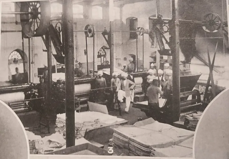
Photo: Unknown photographer (possibly Somerset Playne), Public domain, via Wikimedia Commons
Spot colour is often discussed as a design choice. In litho production it is also a manufacturing choice, and the costs arrive one plate at a time. A four-colour job is not a fixed template with optional extras attached; each additional ink adds its own set-up, its own opportunity for variation and its own claim on the schedule. For UK print buyers, the practical question is not whether spot colour is expensive in principle. It is where the money goes, and whether the printed result justifies the extra.
A plate is the smallest part of the bill
The plate itself is rarely the dominant cost. What matters is everything the plate sets in motion: an ink unit, a duct, a wash-up, a place in the make-ready sequence and a colour that has to be brought into line before the run can be approved. On a long run, plate and make-ready costs are spread across many sheets and can look modest per copy. On a short run, the same costs are divided by a much smaller number, which is why a fifth colour can feel disproportionately expensive on a 500-sheet job.
Press time, wash-ups and the cost of another variable
Every extra ink adds press time. Some of that is visible in the quote as make-ready; some sits in the less visible work of matching a drawdown, checking a wet proof and cleaning the unit before the next job. Wash-ups are not free, and neither is the press time lost while they happen. A spot colour also introduces another variable to control. If the job already carries four process inks, a fifth ink gives the press operator one more thing to balance. That does not make spot colour a bad choice. It does mean the buyer should treat it as a production decision, not a decorative one.
Spoilage and paper waste
Make-ready consumes paper. So does colour approval, and so does the run-up to a stable colour. A spot ink can increase the number of sheets needed before the operator is satisfied, particularly where the colour is a large solid or a close match to a brand reference. On a B1 sheet, a few hundred extra sheets are not a rounding error. There is also the question of ink coverage. A heavy spot lay-down can affect drying, set-off and the way sheets are handled before finishing. The quote should account for that, and the buyer should ask whether it does.
The Pantone question
Pantone matching is often the reason for a spot colour, but it is not the only reason. A spot can be justified by a brand colour that must remain consistent across jobs, by a large solid that would look uneven in a four-colour build, by fine reverse type that needs a clean edge, or by a metallic or fluorescent effect that process inks cannot reproduce. Conversely, a four-colour build can be the better answer for a small accent, a one-off piece, or a colour where a close approximation is acceptable. The point is not to avoid Pantone. The point is to decide whether the match is doing real work.
When the extra ink earns its keep
Spot colour tends to justify itself when the colour is part of the identity of the piece. A brand colour used across a campaign, a solid panel that has to look flat and even, a colour that must sit consistently on two different stocks, or a finish that is meant to be noticed: these are cases where a dedicated ink can be the more reliable route. It also earns its place when the alternative is a four-colour build that needs heavy coverage to hit the colour, because heavy process builds can bring their own problems with drying, show-through and variation.
When a four-colour build is the sensible compromise
A spot colour is harder to defend when it appears in a small logo, a thin rule or a single word and the colour is not carrying the design. In those cases the extra plate, wash-up and press time may buy very little. A four-colour build can be perfectly serviceable, provided the buyer understands that some colours will not match a Pantone reference exactly. The right question is not whether a colour can be removed, but what that colour is doing and what would change if it were built from process inks.
Questions that improve a quote
Before approving a spot-colour quote, ask which inks are spot and why. Ask whether the job could run with one spot plus CMYK rather than two or three separate spots. Ask how the price changes at different quantities, because the economics of an extra plate are not linear. Ask whether the stock affects the colour, and whether the same ink will behave differently on an uncoated or textured sheet. Ask what happens if the spot is dropped: does the design still hold, or does the piece lose the thing that made it worth printing?
A practical rule
Count the independent inks, then count the reasons for each one. If a spot colour is carrying brand recognition, a large solid or a specific material effect, it probably belongs in the job. If it is carrying a small decorative detail that could be approximated in four colours, it is worth challenging. The aim is not to strip impact out of the piece. It is to make sure the buyer is paying for impact rather than for habit.