What You Approve Is Not What You Press: Agreeing Colour Before the Plates Go On
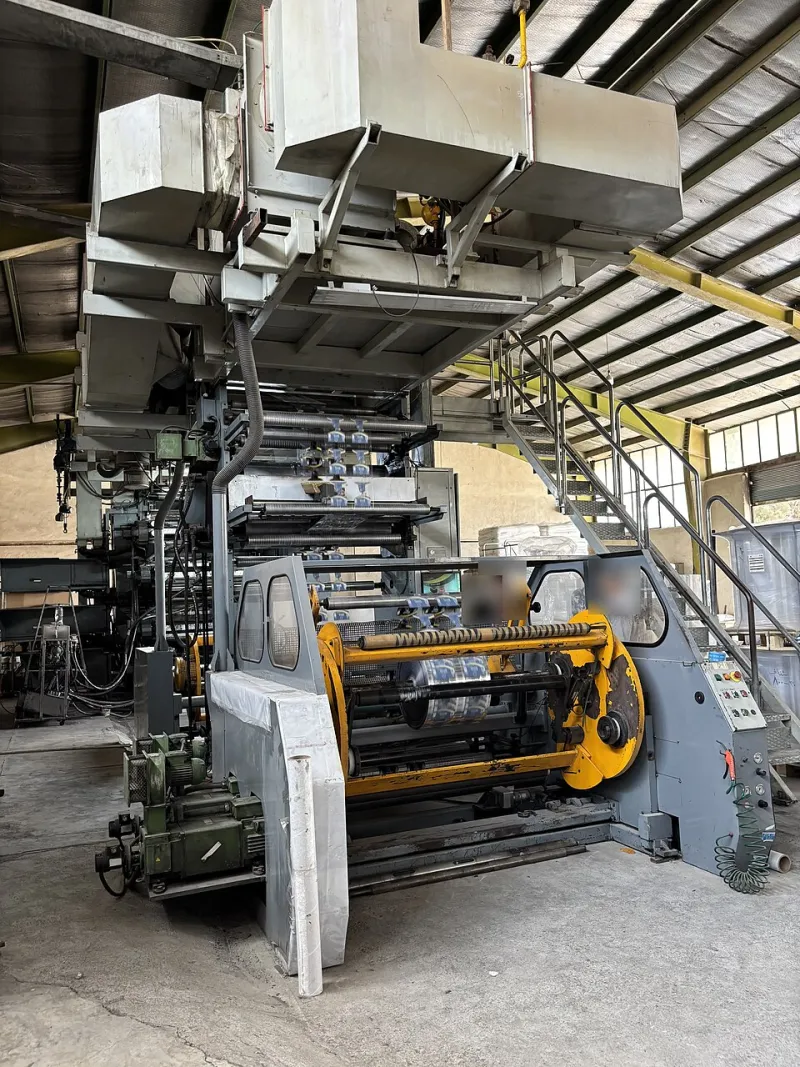
Photo: Navid Selfon, CC BY-SA 4.0, via Wikimedia Commons
Every litho job begins with an act of faith. A file leaves a studio, a sheet comes back, someone in a meeting says the word "approved", and several tonnes of paper and ink are committed to the result. The trouble is that the thing being approved is rarely the thing that will be printed. It is a representation of it, produced by a different device, on a different substrate, viewed under different light.
That is not a scandal. It is simply how the process works, and it is entirely manageable — provided the buyer and the printer agree on what the proof is for before the plates are made.
Three kinds of proof, three different promises
The word "proof" covers at least three unrelated objects, and buyers often use it as though they were interchangeable.
A contract proof is the strongest of the three. Produced to a recognised characterisation data set — ISO 12647-2 is the usual reference for sheetfed litho in the UK, with FOGRA39 and its successors commonly cited — it is generated on a system calibrated to simulate a specific press, ink set and substrate. It is called a contract proof because it functions as one: a documented reference against which the printed sheet can later be measured and judged.
A digital or desktop proof is a convenience. It is useful for checking copy, layout, imposition and the general direction of image tone. It is not colour-managed to a press condition unless someone has deliberately made it so, and even then an office inkjet's gamut, dot structure and paper white are their own.
A screen proof is not a proof at all. It is a file rendered by a monitor, under whatever ambient light happens to be in the room, viewed by eyes that have been staring at it for six hours.
Much of the friction in print commissioning comes from treating the second and third as though they carried the authority of the first.
Why the press drifts away from the reference
Even with a correct contract proof and a well-run press, variation is normal and expected.
Ink density is the largest single lever. Density targets are set per ink and per substrate; a press running slightly heavy will look richer and slightly darker, one running light will look flatter. Both are within tolerance and both will differ from the proof in ways a trained eye notices and a casual one does not.
Dot gain varies with ink film, blanket condition and stock. Coated sheets hold dots tightly; uncoated stocks spread them, thickening mid-tones and dulling highlights. This is not error — it is the substrate doing what it does.
Paper tint is the quiet offender. Two sheets of 170gsm material, one bright white and one with a warm natural cast, will render the same CMYK build completely differently. The ink sits on the surface and the surface reflects back through it. A job proofed on one stock and printed on another has been approved in a different colour world.
Screens speak a different language
A monitor shows additive RGB. A litho press lays down four subtractive inks, sometimes more. The overlap between those gamuts is large but not complete, and the gap is where disappointment lives.
Vivid oranges, saturated greens and clean cyans often sit outside what process inks can reach on a given stock. A spot colour may close the gap; nothing will close it entirely without adding a fifth or sixth ink. Buyers who understand this early tend to specify Pantone references for brand-critical elements rather than asking four-colour process to do something it was never designed to do.
Ambient light matters too. A sheet approved under warm office lighting and then checked against a window will look like two different jobs. This is why proofs are conventionally assessed under standard D50 viewing conditions, and why a viewing booth is not the affectation it appears to be.
The sign-off language that prevents trouble
A vague approval — "looks great, go" — transfers all the risk to the buyer. A useful approval states what has been agreed and what variation is acceptable.
Points worth putting in writing before plates are made:
- The reference standard. Name it. "Match to the supplied contract proof, produced to ISO 12647-2, FOGRA39, on the specified stock."
- The substrate. State the exact stock the proof represents, and confirm the job will run on it. If a substitution is likely, proof on the substitute or accept the difference explicitly.
- The tolerance. Agree a measurable band rather than an aspiration. A mean colour difference of around ΔE 3–5 across a control strip is a common working tolerance for commercial work; photographic and brand work may warrant tighter agreement.
- Viewing conditions. Name the light under which the sheet will be judged. D50 is the default.
- What is out of scope. Fine detail in very small type, overprint behaviour in dark neutrals, and the exact appearance of metallics are all areas where proofs mislead. Say so up front.
- Who signs. One named person, one dated approval, one retained copy of the approved proof held by both parties.
The honest position
Litho will not match an RGB file. It cannot, and a printer who says otherwise is either misunderstanding the question or hoping you will not ask it again. What litho does offer is repeatability: once a condition is established and agreed, the second run will sit very close to the first, and the fifth close to both. That consistency is worth more to most UK businesses than a single heroic match.
Approach the proof as the start of an agreement rather than the end of a design. Decide what matters, write down the tolerance, proof on the paper you intend to use, and look at the result under the light in which your customers will see it. The colour you get will still not be the colour you signed off. It will, however, be the colour you agreed — which is a considerably more useful thing to have in writing.